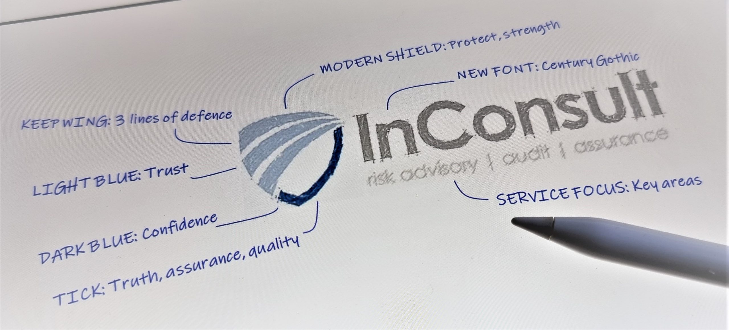
For the first time in two decades, InConsult has reimagined its brand and distinctive wing logo, a symbol of rising above the challenges.
“We have been in business since 2001, that’s 20 years now, and our existing logo has served us well. It was developed at a time when we were still forming our services, very few clients and did not have a sense of identity” said Director, Tony Harb.
“For this brand and logo refresh, we wanted a logo that is modern, but we did not want to completely cut ties with the 3 line wing concept altogether. The light blue wing is very well known to our current clients, but on it’s own, does not truly represent all that we are today”.
“We wanted a logo that is more representative of what we mean to our clients today, how we want to make them feel and a logo and brand identity to take us forward well into the future”.
The new logo retains the wing and similar light blue colour palette but modernises the font and transforms the logo into a modern shield to represent protection, safety, security, stability, strength and confidence.
“We want our clients to feel protected by our end-to-end risk management, resilience, audit and assurance services”. Back in 2001, our only service was risk management. Today, we offer a more comprehensive range of risk management services that extend to risk management technology, cyber risk, climate risk, risk culture, risk appetite, third party risk and strategic risk management. We have also moved beyond risk management to crisis management, resilience, fraud prevention, internal audit and assurance services”, said Harb.

“Our mantra has always been to encourage organisations to take more calculated risks to realise opportunities and create value. But we want them to do this by understanding the risks first and putting a strong control environment in place (systems, people, culture and processes) that work together to guide and protect them on their journey”.
Look closer and you will also see a dark blue tick or check mark in the new logo, an affirmative symbol used in audit, governance, quality control and compliance to represent something is correct and to provide assurance. Historically, a tick is representative of the first letter of the Latin word Veritas – meaning true or truth! The dark blue colour was chosen for its representation of confidence.
“Whether we are helping to design a robust risk management framework, evaluate risk culture, assess the impact of climate change, test a disaster recover plan, or conduct an internal audit, our clients expect us to reveal and present the truth”, said Harb.
The new identity did not just happen overnight. In recent years, InConsult undertook a series of branding strategy workshops to help establish a more targeted and unique brand identity to align to the organisation’s purpose and culture statement more closely. The output of the workshops was a brand archetype with characteristics associated with providing structure, guiding the way forward, caring, protecting, controlling and uncovering the truth.
The challenge was to capture that brand archetype and to deliver the refresh look and feel to the brand’s corresponding logo. InConsult partnered with Mike and Nick from Thiink Consulting and designer George Moussa on the refresh project.
Just like our services have evolved, so to has our logo and identity. Metaphorically, the new logo says – armed with a shield (InConsult services) an organisation can confidently move forward, take risks and be more resilient.

“The new logo is a symbol of confidence when taking risks to realise opportunities. It represents the work we’ve done over 20 years to deliver quality risk management, audit and assurance services to our clients and the work we still have to do together, as we face a bright and yet uncertain future.
Whilst the logo and brand identity has changed, some things will remain the same. “Our commitment to our clients, value for money and quality service will not change. Our highly experienced, professional and committed team will remain the hallmark and a key differentiation point between us and our competitors”.
“InConsult will always be there to help organisations pursue their vision, confidently take risks, be more resilient and stay in control” said Tony Harb.